Wednesday, 21 March 2018

Where i'm at now?

Study Task 7

Primary Research: Watching these movies and writing my own notes and analysis between these movies and their effectiveness of being scary. 


Secondary research: 

Books:
  • ·      A rough Guide to Horror Movies (Alan Jones, 2005, Rough Guides Ltd)
  • ·      Horror Cinema (Taschen, 2017, BiblioTecha Universalis)
  • ·      Why Horror Seduces (Mathias Clasen, Oxford University Press)

Media and Processes: I have decided to use the medium of gauche and digital paint to display some of my own work, which is studies of some scenes from Horror movies and paintings. 


I I began by watching these movies, and analysing how scary and atmospheric they were. I then moved on to reading some of the wider context and information about how these movies were made. I then decided that all of the movies I watched used colour particularly well, and wanted to see if I could create effective studies using just 5 of their colours in both digital and traditional paint. I surmise that it was effective at getting the atmosphere across, but not as well as it would have been had I done super detailed paintings. This I did to see which colour palette I could potentially use in my own character design. 


Study Task 3

Defining Important Concepts 

A concept that I have discovered and have decided to follow is the concept of the "Gentleman Vampire". This has become incredibly useful in my designing process and my research.


This particular example comes from the Universal film "Dracula (1931)" from Tod Browning. This perfectly represents the "Gentleman Vampire". Dracula holds himself as a well respected man however ends up being a killer by nature. This particular scene is when Dracula confronts Van Helsing after he finds that Van Helsing is aware of his true identity. This movie was definitely aimed at an adult audience as it is a horror movie.

An article which supports this can be found here: https://www.glk.uni-mainz.de/Dateien/Metzdorf.pdf . This article discusses the idea that Dracula, in his position of power  which spans over centuries functions as a symbol of "Victorian Anxieties". One such Victorian anxiety was the rise of the poor against the powerful rich, as was a big scare around the time of Jack the Ripper.

Tuesday, 20 March 2018

Beginning of the Book - The Target Task

To begin my sketchbook. I began by making the circle in which I put myself in the centre of a target, and labelled my interests, and continuing to build on these interests into something that can be produced into an idea which I can study this year. I listed all my interests as well as their sociological and artistic relations, just from this, there seems to be some sort of Gothic/ Horror movie theme, so I think I am going to start exploring the type of things I can do with this.

Below is my target for COP


COP sketchbook - Designing Dracula

To make sure I do not make too many of these, I wanted to save a lot of time and words to explain the choices I made in the designing of my own Dracula. Due to time constraints I have reigned back my final outcome to character sheets and keyframes, rather than a fully animated outcome, as I thought the character and setting was more important than the actual animation, as it represents the essence of what my question is all about, and also, with some noted aid explains how these designs tie in to the social context of today and also keep within the general rules of the character.


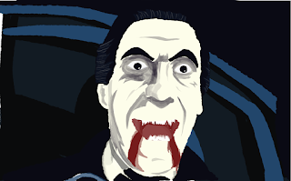
As is obvious from the pictures above, I actually made 2 passes at the classic take on the character. To design him I looked at fashion of the time period, as well as the movies and fiction of the character that existed at the time to make sure I was making him time specific. I also followed the colour palette I had made from the 1931 Dracula movie in order to make him more authentic. He is heavily based on Belo Lugosi, but obviously he is meant for an animated setting, rather than a live action. I wanted very much to keep within the realm of "gentlemen vampire" as this is who the character was at the time, and I needed to make sure I respected that. I actually like this version of the character the most, I think there is actually somewhat frightening about the upper class person taking advantage of their power in order to kill the lower class person. I think this is something that is used a lot in movies today, but I think this is where it started, with the Vampire and horror movies of this era.

Here you can see my process for designing the modern Dracula. For this, using my research of modern day men's fashion, I decided to use the colour script from the 2014 movie "Dracula Untold". I believed that this would supply me with at least most of the colours I could use to create and effective Dracula. The designing of this one, ended up becoming designing a fashionable high class man of the modern day, because I wanted to stick to the Gentleman Vampire aspect of which Dracula had started as. I think today more than ever there is fear of the upper class being above and being able to take advantage of the lower class people, so this is something that I wanted to play on in the designing of this version. He is very pale in skin tone and has bright yellow eyes, just to drive the inhuman aspect home, rather than him being generic white guy from any movie ever. I decided with this version, to make him quite muscular, as Dracula's whole point is to draw people in, and then murder them by sucking on their blood, I thought he had to be as attractive as possible from a 2018 stand point in order to make him an effective gentleman killer.

COP Sketchbook - Looking at Backgrounds

For this section of my sketchbook, I have skipped over some more paint studies and research to go into this more relevant section, I wanted to look at setting and backgrounds. In my sketchbook I have made mood boards and looked at specific sets and paintings that relate to gothic imagery, a lot of Tim Burton and a lot of sets from the original Dracula films. This I decided was necessary for design and animated version, as the setting can add a lot to the character. For this I made 2 backgrounds with different colour palettes. These were to fit with the 2 different versions I want to design. the first being a classic, 1930s Dracula, based on Belo Lugosi, and the present day 2018 Dracula which is completely designed by me.


Personally I believe the classic one is a lot more effective at getting the mood across as it represents and shows the colours that a gothic setting would stereotypically have.

Cop Sketchbook - Some Painting

Before starting on my character designs, I wanted to have a practice at doing some digital and practical painting using only the colour scripts I had made. This was purely for practice reasons seeing if I could create the image effectively using the specific colour palette, so I am not afraid to admit there is some heavy reference going on in some of them.

The task proved challenging as using only 5 specific limits greatly what you are able to do. As is shown below, it is hard to really capture the likeness, especially in the case of the more modern studies. This is something I am going to have to consider when designing my own version as I imagine I will have to take some sort of artistic liberty and add some colours here and there.


Study Task 2

For this section, I decided to use the text from Laura Mulvey; "Visual Pleasure and Narrative Cinema". From my understanding, I believe the concept that Mulvey is trying to convey, is that there is a stigma around the imagery of female roles and the human form in general which attracts us to certain character in cinema, and gives us some form of pleasure from watching these characters. It is my understanding that Mulvey somewhat acknowledges the move away from the patriarchal roles of women in film as the years progress but that it is still an issue.


I believe these quote to represent the overarching concept which Mulvey is trying to convey to the reader.

I feel like there is any number of outer world examples that follow this particular train of thought, however if I were to name a few playboy tends to play into this particular category of which Mulvey talks about, playing on the "looked at ness" of the still human form. This is also present in tv shows such as baywatch, which objectify women to be eye candy to men.

This could be tied into my theme, as most of the time, when Dracula strikes his victims, it is a young woman, and when he does this, many reviewers have described the act as sensual. Even the film "Bride of Dracula" she is incredibly sexualised, as opposed to Dracula himself who is supposed to be intimidating. This proves Mulvey's point of the patriarchal roles in society, and how the bride is sexualised in the eyes of the husband.